Responsive View: Easily Test Different Screen Sizes
Responsive View is a free Chrome extension developed by Aneeta Kolhe. It falls under the category of Browsers and is classified as an Add-ons & Tools subcategory. This extension provides users with the ability to view web pages in different screen sizes with just a click.
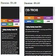
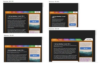
With Responsive View, you can quickly test how a webpage appears on various devices and screen sizes. Whether you want to see how your website looks on a mobile device, tablet, or desktop, this extension has got you covered. It offers a range of screen sizes, including 340 x 480 for mobile, 480 x 640 for larger mobile screens, 768 x 1024 for tablet (portrait), 1024 x 768 for tablet (landscape), 992 x 640 for Bootstrap, and 1200 x 800 for desktop.
Using Responsive View is simple. Just navigate to the webpage you want to test, click on the extension icon, and scroll vertically to view the page in different screen sizes. This extension is a valuable tool for web developers, designers, and anyone who wants to ensure their website looks great across different devices.